 The RelativeLayout is the second most common layout I’ve used after the LinearLayout. Today as we continue our 31 Days of Android, we’ll be focusing on the RelativeLayout. Remember that all of our layouts are descendants of ViewGroups which descend from Views. Furthermore, ViewGroups contain Views. Recalling all of that, we’re ready to dig deeper into the RelativeLayout. We’re going to start with a stripped down version of yesterday’s code which you can grab here.
Where as the LinearLayout stacks it’s elements one after another vertically or horizontally, the RelativeLayout requires each of it’s elements to specify it’s own position in regards to it’s fellow elements and it’s parent. I say requires because technically you don’t actually have to specify the position. We’ll get this set up so you’ll see what I’m talking about. Today you’re going to make all of our changes to main.xml. The main.xml layout already has a few different Views including some TextViews, an EditText, and a couple buttons and will look like this:
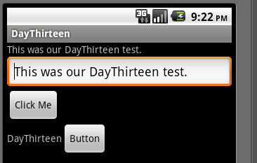
The xml for this layout is as follows:
<?xml version="1.0" encoding="utf-8"?>
<LinearLayout xmlns:android="http://schemas.android.com/apk/res/android"
android:layout_width="fill_parent"
android:layout_height="wrap_content"
android:orientation="vertical">
<TextView
android:id="@+id/lblTextViewOne"
android:layout_width="wrap_content"
android:layout_height="wrap_content"
android:text="@string/hello"/>
<EditText
android:id="@+id/editText1"
android:layout_width="match_parent"
android:layout_height="wrap_content" >
<requestFocus />
</EditText>
<Button
android:id="@+id/button1"
android:layout_width="wrap_content"
android:layout_height="wrap_content"
android:text="@string/click_me" />
<LinearLayout
android:id="@+id/linearLayour2"
android:layout_width="wrap_content"
android:layout_height="wrap_content">
<TextView
android:id="@+id/textView2"
android:layout_width="wrap_content"
android:layout_height="wrap_content"
android:text="@string/app_name"/>"
<Button
android:id="@+id/button2"
android:layout_width="wrap_content"
android:layout_height="wrap_content"
android:text="Button" />
</LinearLayout>
</LinearLayout>
So let’s start by changing the root layout from a LinearLayout to a RelativeLayout. All you need to do is change the Linear to Relative and your xml should look like this:
<?xml version="1.0" encoding="utf-8"?>
<RelativeLayout xmlns:android="http://schemas.android.com/apk/res/android"
android:layout_width="fill_parent"
android:layout_height="wrap_content"
android:orientation="vertical">
...
</RelativeLayout>
Run your project and you should be greeted by this crowded looking screen:
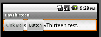
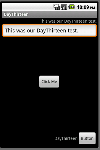
As I said before, the RelativeLayout requires you to specify each child’s position in relation to it’s parent and siblings. Since we didn’t specify anything for the RelativeLayout’s children, they all defaulted to the top left of the parent. There are going to be some circumstances where it might make sense to have things overlap, but in this case, we don’t want that. Let’s say we want to make the view do the following:
- Show the TextView that was at the top at the top right of the screen.
- Show the EditText beneath that aligned on the left side of the screen.
- Show the first Button in the middle of the screen.
- Show the TextView and second Button at the bottom right of the screen
The RelativeLayout gives us several new attributes that we can set on each of it’s children. The first thing you want to adjust is the layout_height of the RelativeLayout from wrap_content to fill_parent. If you don’t layout will stay squished even when you say to put the elements at the bottom of the screen. Your altered layout XML should look like this:
<RelativeLayout xmlns:android="http://schemas.android.com/apk/res/android"
android:layout_width="fill_parent"
android:layout_height="fill_parent"
android:orientation="vertical">
Now you’re ready to start making the above changes. Let’s start at the top with the first TextView. It’s already going to be at the top of the RelativeLayout by default so you just need to specify that it’s on the right. This is done using the layout_alignParentRight attribute:
<TextView
android:id="@+id/lblTextViewOne"
android:layout_width="wrap_content"
android:layout_height="wrap_content"
android:text="@string/hello"
android:layout_alignParentRight="true"/>
Interestingly, if you rerun your application now, you won’t see any difference. The reason for that is that elements are drawn from top to bottom from the layout xml. Since the lblTextViewOne is at the top of the XML it get’s drawn first and is overlapped by the other Views. Once you’ve finished moving some more elements, you’ll see the TextView in it’s new position. Since you want the EditText below the first TextView you’ll want to use the layout_below attribute. This takes in an ID for the element you want it to be below so we’ll use lblTextViewOne. The changed EditText will look like this:
<EditText
android:id="@+id/editText1"
android:layout_width="match_parent"
android:layout_height="wrap_content"
android:layout_below="@id/lblTextViewOne">
<requestFocus />
</EditText>
Now when you run your app, you’ll start to see something better:
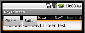
Now you can see that your TextView is indeed at the top right of the layout and the EditText is right beneath that. You’re half way done with the changes. Next, let’s put the first button in the middle of the screen. To do this, you want to use the layout_centerInParent which will center our element both vertically and horizontally in it’s parent. Now your Button xml will look like this:
<Button
android:id="@+id/button1"
android:layout_width="wrap_content"
android:layout_height="wrap_content"
android:text="@string/click_me"
android:layout_centerInParent="true"/>
Now run your app and feast your eyes upon a centered button:
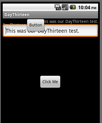
Now you’re ready for your last change. The LinearLayout need to be at the bottom right of the screen. To do so, you’ll need to use the layout_alignParentRight attribute again as well as layout_alignParentBottom. I’m sure you can guess what setting the layout to align to the parent’s bottom. Here’s your altered XML:
<LinearLayout
android:id="@+id/linearLayour2"
android:layout_width="wrap_content"
android:layout_height="wrap_content"
android:layout_alignParentBottom="true"
android:layout_alignParentRight="true">
And your screen finally looks the way you want it to:
You could make something that would look similar using a LinearLayout if you tried but it wouldn’t be nearly as efficient as what you’ve done here. There are a few RelativeLayout specific attributes that we didn’t use today so I’ll cover them quickly:
- layout_toLeftOf - Aligns the element to the left of whatever element you pass in.
- layout_toRightOf - Aligns the element to the right of whatever element you pass in.
- layout_above - Aligns the element above of whatever element you pass in.
- layout_below - Aligns the element below of whatever element you pass in.
- layout_alignBaseline - Aligns the element with the middle of whatever element you pass in.
- layout_alignLeft - Aligns the element with the left edge of whatever element you pass in.
- layout_alignRight - Aligns the element with the right edge of whatever element you pass in.
- layout_alignBottom - Aligns the element with the bottom edge of whatever element you pass in.
- layout_alignParentLeft - Aligns the element with the left edge of it's parent.
- layout_alignParentTop - Aligns the element with the top edge of it's parent.
- layout_centerHorizontal - Horizontally centers the element in it's parent.
- layout_centerVertical - Vertically centers the element in it's parent.
The last RelativeLayout attribute to talk about is layout_alignWithParentIfMissing. If this attribute is set to true, then it will treat the element’s parent as it’s anchor if the element specified in layout_toLeftOf, layout_toRightOf, layout_above, etc can’t be found. So for example, if you set an element’s visibility to GONE but another element referred to it in one of the RelativeLayout specific layout attributes, it will use the parent instead.
You’ve already got a LinearLayout inside of a RelativeLayout in this example. You could reverse this and have a RelativeLayout inside of a LinearLayout or have several nested layouts. The point is that with just these two different ViewGroups you can create some very complex views. There are some other important common layout types that we’ll go over but understanding these two types will get you far with developing your Android apps.
You can grab today’s final code here.