So far in our 31 Days of Android series, we really haven’t focused on the visual element of our applications at all. We’ve created some layouts and we’ve added a few UI controls, but we haven’t delved into it much. Starting today, we’re going to spend a few days talking about the different layouts and interface elements. You can use the code we left off with yesterday to start out with (I’ll be referring to it with a DayTwelve instead of DayEleven today).
The first thing you should know is that all of the layout types (including the LinearLayout) as well as all of the user interface elements (TextView, EditText) descend from the View class. Layouts descends from a ViewGroup class which in turn descends from View. Being a ViewGroup means that it can contain other views. If you look at the main.xml file in the res/layout folder, you’ll see that the layout we’ve been working with so far has several Views contained in a ViewGroup, in this case a LinearLayout:
<?xml version="1.0" encoding="utf-8"?>
<LinearLayout xmlns:android="http://schemas.android.com/apk/res/android"
android:layout_width="fill_parent"
android:layout_height="fill_parent"
android:orientation="vertical" >
<TextView
android:id="@+id/lblTextViewOne"
android:layout_width="fill_parent"
android:layout_height="wrap_content"
android:text="@string/hello" />
<EditText
android:id="@+id/editText1"
android:layout_width="match_parent"
android:layout_height="wrap_content" >
<requestFocus />
</EditText>
...
</LinearLayout>
Here there are only Views in the LinearLayout but there is nothing preventing you from putting other ViewGroups into the root ViewGroup (so layouts within layouts). If you run the app you should have it show up like this:
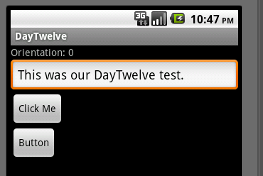
Looking at the XML and what your app shows, you should be able to glean that a LinearLayout simply allows you to stack Views inside of it (in either a vertical or horizontal orientation). Let’s start looking at the attributes of the LinearLayout:
<LinearLayout xmlns:android="http://schemas.android.com/apk/res/android"
android:layout_width="fill_parent"
android:layout_height="fill_parent"
android:orientation="vertical" >
layout_width and layout_height will be in many of the views you’ll use in Android apps. Here you’re saying that the root LinearLayout should fill up the whole screen by setting them both to “fill_parent”. The alternative “present” values are “match_parent” and “wrap_content”. If you change the layout_height value to be wrap_content and rerun, the app has changed but you won’t be able to see it. Since the background is black by default, there is no way to differentiate the bottom of the layout from the rest of the background. In order to demonstrate this in action, you’re going to add a new xml values file and set a new attribute on your layout. Start by right clicking on the res/values folder, go to New—>Other and choose Android XML File. In the name enter “colors.xml” and click Finish. This generates a new resources file where we can specify different colors. We want a nice bright green color so when you’re done your xml should look like this:
<?xml version="1.0" encoding="utf-8"?>
<resources>
<color name="Green">#59FF00</color>
</resources>
Now you can access this color in the same way you’ve accessed values in the strings.xml file before. Going back to your main.xml layout file, make sure you’ve set the layout_height to be “wrap_content” and then add the background attribute and specify your new color value using “@color/Green”. When you’re done, the root LinearLayout should look like this:
<LinearLayout xmlns:android="http://schemas.android.com/apk/res/android"
android:layout_width="fill_parent"
android:layout_height="wrap_content"
android:orientation="vertical"
android:background="@color/Green">
Now when you run your application, it will look a little bit different:
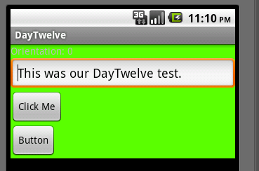
So what’s happened here is that you’ve set the background to green and said to only make the layout big enough to wrap what’s inside of it. We have 4 Views in our layout so the layout ends immediately after the last View, in this case the second Button. As I mentioned before, black is the default background color in the Android emulator so since we’re not specifying anything besides our LinearLayout the black default takes over. If you change layout_height back to “fill_parent”, you’ll see the green expand to the bottom of the screen.
For now, drop the background color so your app is a little easier to look at. The last attribute that was already in your LinearLayout is orientation which is set to “vertical”. By default when you create a new layout with it’s base ViewGroup being a LinearLayout, it will have a vertical orientation. If you remove the orientation attribute from the layout, it will be horizontal by default. Go ahead and remove the orientation attribute so your xml looks like this:
<LinearLayout xmlns:android="http://schemas.android.com/apk/res/android"
android:layout_width="fill_parent"
android:layout_height="fill_parent">
When you run your application, you’ll be treated to an odd sight, only the “Rotation: 0” will be visible:

The reason you’re only seeing the first TextView is because it’s layout_width is set to fill_parent. If you change it to wrap_content and run your app, now it should look like this:

This doesn’t look very good and we could “fix it” by putting some space between our two Views but in this situation, we really want our root LinearLayout to use the vertical orientation so that we can use the whole screen.
The next two attributes we’ll look at are gravity and layout_gravity. The difference between these two can be slightly confusing but with enough experience, you should be able to pick it up (and fortunately it’s easy to switch between the two if you can’t remember). layout_gravity controls the gravity of the View it’s set on in it’s parent. So if you set the layout_gravity of the LinearLayout it’s relative to the root. gravity controls the gravity of all of a View’s children. So if you set the gravity on the LinearLayout, it will affect the TextView, EditText, and Buttons. Let’s actually try it out and see what happens. First, try setting gravity of the LinearLayout to “center_horizontal” your app will look like this:
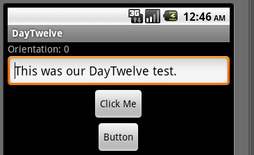
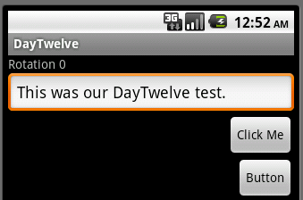
Remember that gravity affects a View’s children and it will make sense that all of your children Views are in the middle of the screen. Remember that the first TextView appears to not be centered but that is actually because it’s layout_width is set to “fill_parent”. If that was changed to “wrap_content” then it too would appear in the center. Conversely, if you don’t set gravity but instead set layout_gravity to “center_horizontal”, and then run your app it will look the same as it did before you added any gravity attributes. Similarly if you set layout_gravity to “right” it won’t look any different. If gravity is set to “right” though, your app will look like this:
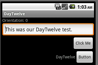
The last layout related thing we’ll cover today is adding a ViewGroup to another ViewGroup. Specifically in the app we have right now, let’s say we want to have a TextView to the left of our second button. There isn’t anyway we could just drop a TextView in and make it work right now. First, we need to drop in another LinearLayout. Remember that if you don’t specify an orientation, it will assumed to be horizontal. Once we wrap the button2 in this new linear layout, we can add a new TextView in as well. Your main.xml layout should end up looking like this:
<LinearLayout
android:id="@+id/linearLayour2"
android:layout_width="wrap_content"
android:layout_height="wrap_content">
<TextView
android:id="@+id/textView2"
android:layout_width="wrap_content"
android:layout_height="wrap_content"
android:text="@string/app_name"/>
<Button
android:id="@+id/button2"
android:layout_width="wrap_content"
android:layout_height="wrap_content"
android:text="Button" />
</LinearLayout>
And when you run your app, it should now look like this:
Nested ViewGroups will be something you will end up using very frequently as you develop more sophisticated Android apps though there are some concerns with doing so. Remember that when you call setContentView in your Activity there is some overhead with inflating your view from the xml. If you have tons of nested layouts, it’s going to take longer and use more memory. Thankfully there are other types of layouts you can use to simplify things at times. We’ll take a deeper look at this and other layouts in the next few days.
Also, it’s worth pointing out that as of Android 4.0, Google is recommending you use the new GridLayout instead of LinearLayout.
You can grab today’s code here.